Play with Airbnb - South Aegean Greek Islands (Part 1)
September 1, 2019
R data science data analysis visualizationI went to Greece this summer for my holiday. To be exact, two small, or not that small islands, Samos and Rhodes, on beautiful Aegean for 15 days. The stay on the islands was so amazing that I keep imaging how my life would look like if I owned a house there. In such life, can I put my imaginary property on Airbnb? I was haunting by these thoughts after my holiday and decided to approaching the answers, of course, in the perspective of data.
Library used
library(tidyverse)
library(stringr)
import::from(magrittr, "%<>%")
Data source
The data was retrieved from Inside Airbnb. I downloaded the dataset listing and calendar for the region South Aegean, South Aegean, Greece
# read-in celandar and listing raw data
calendar <- read_csv("./data/calendar.csv") %>%
  mutate(price_numeric = as.numeric(str_extract(price, "\\d+.\\d+")))
listing <- read_csv("./data/listings.csv") %>%
    mutate(price_numeric = as.numeric(str_extract(price, "\\d+.\\d+")))
head(calendar)
## # A tibble: 6 x 8
## listing_id date available price adjusted_price minimum_nights
## <dbl> <date> <lgl> <chr> <chr> <dbl>
## 1 160719 2019-06-28 FALSE $50.… $50.00 1
## 2 160719 2019-06-29 FALSE $60.… $60.00 1
## 3 160719 2019-06-30 FALSE $60.… $60.00 1
## 4 160719 2019-07-01 FALSE $60.… $60.00 1
## 5 160719 2019-07-02 TRUE $60.… $60.00 1
## 6 160719 2019-07-03 TRUE $60.… $60.00 1
## # … with 2 more variables: maximum_nights <dbl>, price_numeric <dbl>In calendar dataset I have about one year reservation data between 06.2019 and 06.2020. In listing dataset I have 22145 properties in this region. Isn’t that exciting? Both dataset contain a textual column price with dollar sign, which is not very useful for data analysis. So I extract the numeric part from price and create a new variable price_numeric.
One thing I noticed in the listing dataset is that, the column amenties contains very long strings that consist of a bunch of amenties, separated by commas. That’s not so charming. I decided to separate this column into several columns where each column represents one amentity provided in the property, and export it as a separate table amentities_df in the long format.
# parse amenties
amentities_df <-
  listing %>%
  select(id, amenities, price_numeric) %>%

  # ensure that all items are separated with comma with no space
  mutate(amenities = str_replace_all(amenities, ', ', ',')) %>%

  # separate strings
  mutate(amenities = strsplit(amenities, ",")) %>%
  unnest(amenities) %>%

  # remove punctuations
  mutate(amenities = str_replace_all(amenities, "[\\{\\}]", "")) %>%
  mutate(amenities = str_replace_all(amenities, '"', '')) %>%

  # give quantity
  mutate(value = 1) %>%

  # remove duplicate amentities for each id
  distinct() %>%

  # spread and replace na
  spread(key = "amenities", value = "value") %>%
  rename(no_amentity_info = V1)

# gather
amentities_df %<>%
  gather(key = "amenities", value = "value", 3:length(names(amentities_df))) %>%
  mutate(value = replace_na(value, 0)) %>%
  arrange(id)
head(amentities_df)
## # A tibble: 6 x 4
## id price_numeric amenities value
## <dbl> <dbl> <chr> <dbl>
## 1 13131 280 no_amentity_info 0
## 2 13443 252 no_amentity_info 0
## 3 23303 400 no_amentity_info 0
## 4 26919 350 no_amentity_info 0
## 5 26921 140 no_amentity_info 0
## 6 29210 43 no_amentity_info 0Data exploratory
Let the journey begin!
Busy
The first quesiton came into my mind is - are the properties on South Aegean still available? The easiest way to check this is to aggregate calendar dataset by available:
# availability ratio
calendar %>%
group_by(available) %>%
summarise(count = n()) %>%
ggplot(aes(x = available, y = count)) +
geom_bar(stat = "identity") +
labs(title="Availability")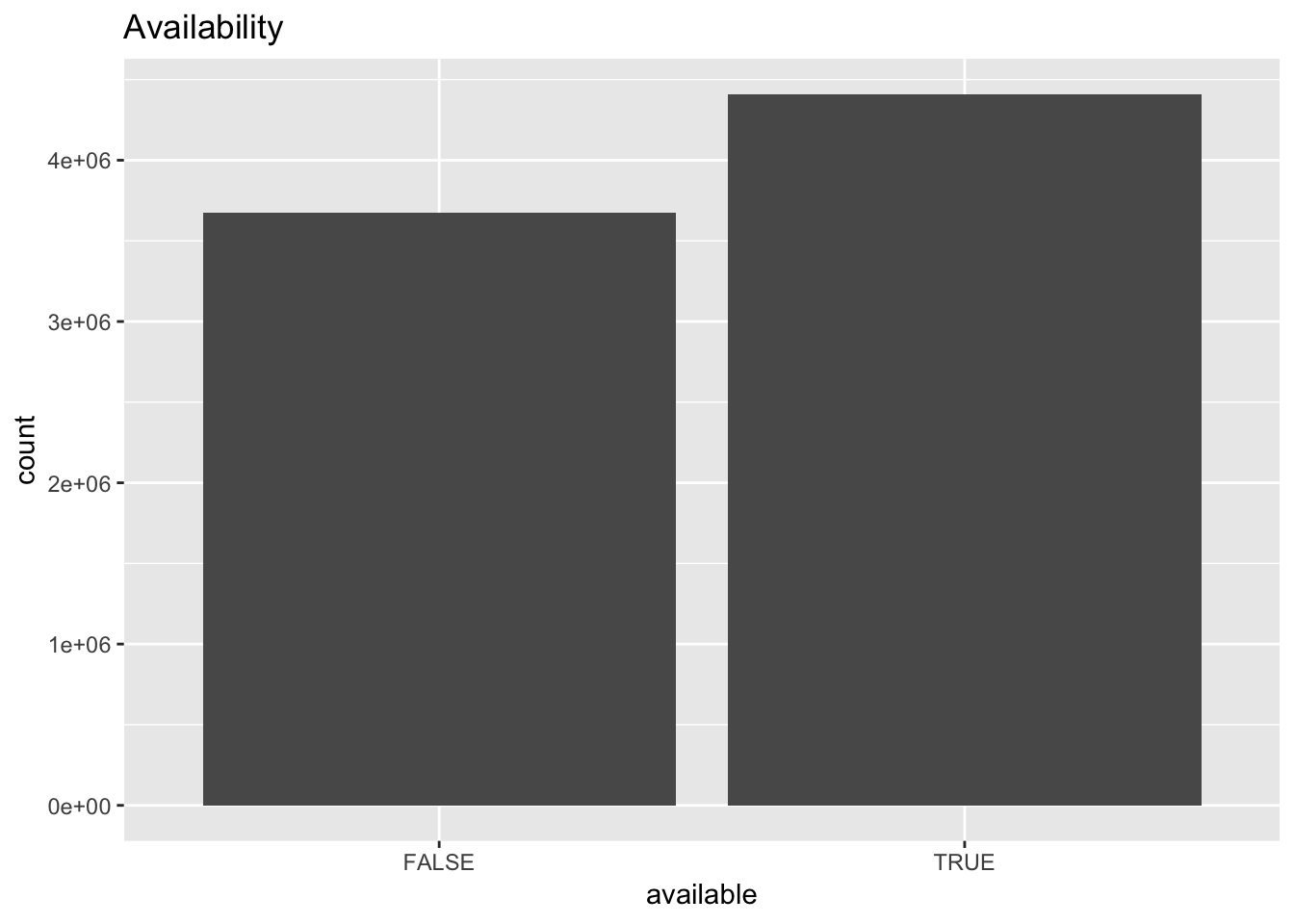 Well, many of them are already booked, but more than half is still available.
My next quesiton is - how busy these properties are? This information is useful to avoid the crowds. Here I created a temporary variable busy which represents the number of properties that are already booked:
# current status of busy
calendar %>%
  filter(available == FALSE) %>%
  group_by(date) %>%
  summarise(busy = n()) %>%
  ggplot(aes(x = date, y = busy)) +
  geom_line() +
  scale_x_date(breaks = function(x) seq.Date(from = min(x), to = max(x), by = "1 month")) +
  theme(axis.text.x = element_text(angle = 45, hjust = 1)) +
  labs(title="Airbnb South Aegean Calendar")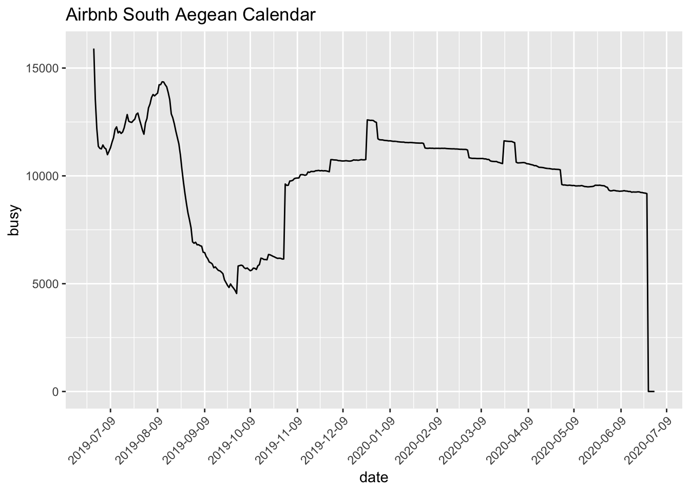
# which day in a week is more busy?
calendar %>%
mutate(weekday = weekdays(date)) %>%
filter(available == FALSE) %>%
group_by(weekday) %>%
summarise(busy = n()) %>%
mutate(weekday = fct_relevel(weekday, levels = c("Monday", "Tuesday", "Wednesday", "Thursday", "Friday", "Saturday", "Sunday"))) %>%
ggplot(aes(x = weekday, y = busy)) +
geom_bar(stat = "identity") +
theme(axis.text.x = element_text(angle = 45, hjust = 1)) +
labs(title="Airbnb South Aegean Calendar") +
xlab("the day in a week")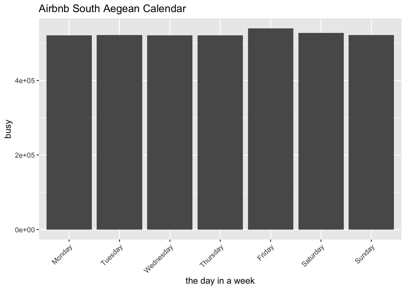 The line chart shows that it’s relatively quiet on September and October, which makes sense as it’s typical low travel season at Greece. Starting from November it becomes busier, and there’s a peak at the end of the year - which aligns with the Christmas/New Year holiday season. There is also another peak in March - maybe a festival or national holiday - not so sure about it though :p
The bar chart shows how busy it is in the days of a week. On Friday it’s slightly busier than other days. Avoid Friday, avoid the crowds (a little bit).
Price
Next, the most important factor for any of my travels - price. Let’s see how the price goes with the months in a year:
# which month has highest price?
calendar %>%
  mutate(month = months(date)) %>%
  group_by(month) %>%
  summarise(m_price = mean(price_numeric, na.rm=TRUE)) %>%
  mutate(month = fct_relevel(month, levels = month.name)) %>%
  ggplot(aes(x = month, y = m_price)) +
  geom_bar(stat = "identity") +
  theme(axis.text.x = element_text(angle = 45, hjust = 1)) +
  labs(title="Airbnb South Aegean Price") +
  ylab("average price")
Apparently the Airbnb landlord are happier during July and August as they certainly make more money out of this period. The price then drops significantly on September, and again (even more!) on October. My favorite novelist Haruki Murakami wrote in one of his book that “The best period to visit Greece is Spetember and October - if you want to save money.” I’m glad my analysis with Airbnb dataset agrees with him :)
Listing items
Let’s explore more on listing dataset, I mean, there’re 107 attributes for each property after all!
Everyone knows Greece has many islands (1200 - 6000). While this dataset only deal with the islands on South Aegean, still I want to know - which island has more properties on Airbnb:
# which island has more airbnb
listing %>%
group_by(neighbourhood_cleansed) %>%
summarise(nr_listing = n()) %>%
ggplot(aes(x = reorder(neighbourhood_cleansed, -nr_listing), y = nr_listing)) +
geom_bar(stat = "identity") +
theme(axis.text.x = element_text(angle = 45, hjust = 1), axis.title.x = element_blank()) +
labs(title="Airbnb South Aegean Property") +
ylab("property count")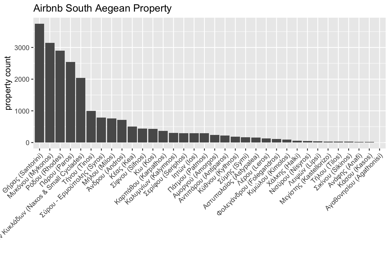 Well, I wouldn’t say I’m suprised that Santorini and Mykonos take the first two places on the list. I mean, they are so called ‘hotspot’ in any Greece travel guide. Nevertheless, what surpises me is the third place - Rhodes. While I was there for three days, I was not aware of the fact that it’s also a popular travel destination. I thought the third place might be Kos, but I was very wrong. That’s exactly the reason we should see things in data perspective :)
Then I’m curious about how customers are satisfied with Airbnb properties:
# rating distribution
listing %>%
  ggplot(aes(x = review_scores_rating)) +
  geom_histogram(aes(y = ..density..), binwidth = 1, alpha = 0.9) +
  geom_density(fill = "#FF6666", alpha = 0.2) +
  theme(axis.text.y = element_blank(), axis.title.y = element_blank()) +
  labs(title="Airbnb South Aegean Property") +
  xlab("rating score")
The distribution is very left-skewed - As I expected - most customers are being nice. I think when people travel, they’re more likely to be generous to everything - as long as it does its job.
Property and Price
Let’s back to the price (sorry, price really matters to me)
First of all, I want to check the price distribution. My rule of thumb is to spend less than 100 euros per night for two persons. Let’s see how this rule works at Greece:
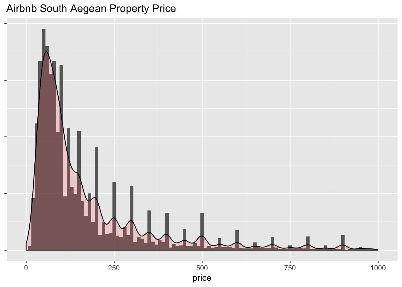
##    Min. 1st Qu.  Median    Mean 3rd Qu.    Max.    NA's
##       0      60     100     171     200     999     983
Hmm, the distribution is right skewed as I expected. The median is exactly 100, which practically means I can choose from half of properties on Airbnb with my rule of thumb. Good to know.
Then I want to know how the price look like for each island. Here I choose boxplot because I want to see the price region for the most properties in each category, as well as the outliers:
# price distribution for each region
listing %>%
group_by(neighbourhood_cleansed) %>%
summarise(nr_listing = n()) %>%
ungroup() %>%
right_join(listing, by = c("neighbourhood_cleansed")) %>%
ggplot(aes(x = reorder(neighbourhood_cleansed, -nr_listing), y = price_numeric)) +
geom_boxplot() +
geom_violin(size = 0.2, color = "gray", fill = "gray", alpha = 0.4) +
theme(axis.text.x = element_text(angle = 45, hjust = 1), axis.title.x = element_blank()) +
labs(title="Airbnb South Aegean Price") +
ylab("price")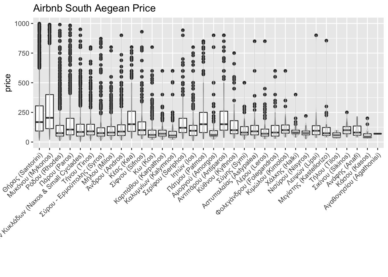 The boxplots are sorted by the number of properties as we saw before. Apparently the popular islands, such as Santorini and Mykonos, have much bigger box which indicates a veriety of property price. Besides, they all have lots of outliers, meaning there’re many fancy (a.k.a. expensive) choices on both islands.
Bed and Price
Airbnb has this little stroy that its founders put an air mattress in their living room, and turn their apartment into a bed and breakfast. I’m just curious about how many properties are still providing air mattress and what’s the price?
 Well, still some properties are providing airbed, but just very few of them, and they’re much cheaper. Hmm…maybe next time I’ll give it a try.
Room and Price
My last question about the property is the room type. When I travel with my partner, I tend to choose entire home if I can afford it. When I travel as a backpacker (long time ago), I choose shared room for the sake of money. The big assumption is: shared room is cheaper, entire home is expensive, and in the middle private room is. Let’s find out how my assumption holds:
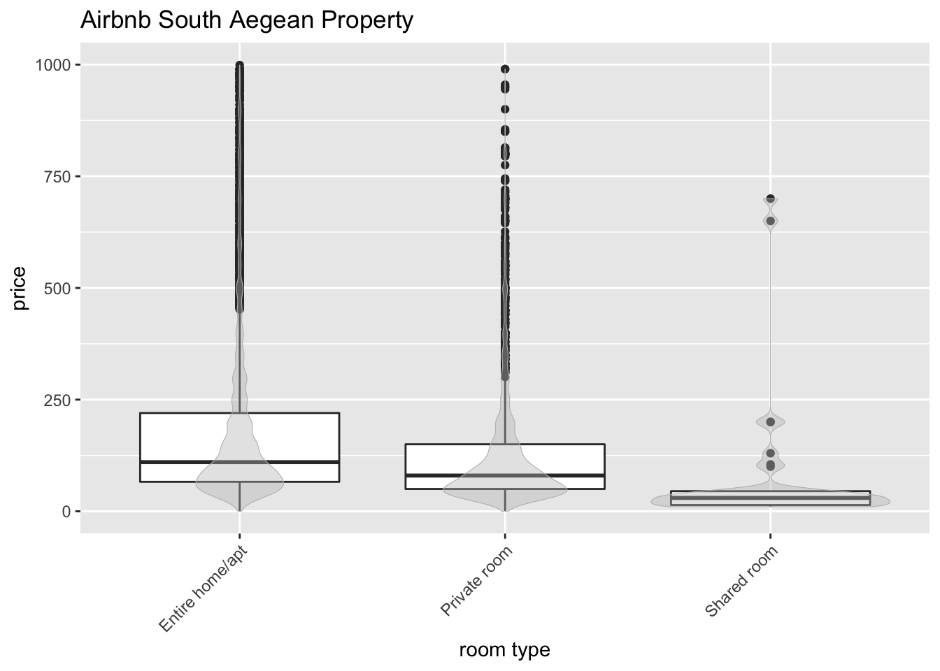 Well, it seems my assumption holds well. Let’s approach the same data with a different visualization:
# stacked histogram for room type
listing %>%
ggplot(aes(x = price_numeric, fill = room_type)) +
geom_histogram(position = "stack", binwidth = 10) +
labs(title="Airbnb South Aegean Property") +
xlab("price")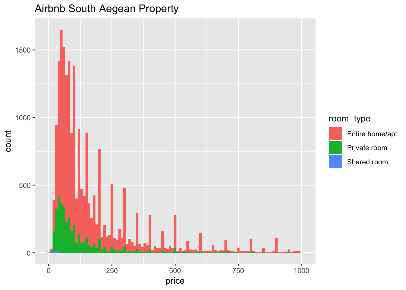 Clearly in the stacked bar chart, green (private room) towards the left, red (entire home) towards the right. I can hardly see any blue (Shared room) because there is too few of them. I guess Greece, especially the South Aegean region, is dominated by vacation accommodation. When people are on holiday, they demand more on the privacy. That makes sense to me.
However, there’re still some private room across the ‘border’ to very high renting price. Some rooms cost more than than 500 euros per night! Seriously?
Amentities
The last thing I’d like to check is the amentities. Although I tried to minimize the use of internet during my holiday, living without WIFI can drive me crazy, especially when I didn’t see it coming before the holiday. Hair dryer is another important one. Let’s find out the top 20 provided amentities, in both lower-50% and upper-50% properties.
I first created a temporary variable price_category to indicate if a property falls into high or low price region. Then I plotted the top 20 provided amentities and sort the plot by the number of properties providing such amentities. 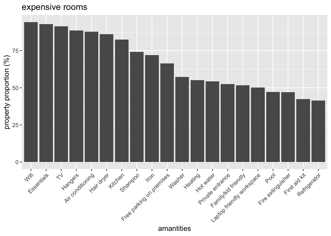
 Well, if I go for expensive rooms, I don’t really need to worry about WIFI - it’s the most frequent provided item!! For chaper rooms, WIFI is also on the third place. I don’t see much difference between the two top-20 lists, so I will stick to my rule of thumb and keep booking cheaper (<= 100 euros) rooms.
The end (for now)
Apparently there’re still a lot to play with in this dataset. But I’ll just call it a day and stop here, for the data exploratory. In the next blog:
I’ll put myself in Airbnb data scientist’s shoes, and come up with a prediction model with the same dataset